The dbt Cloud UI is getting a makeover

last updated on Jun 03, 2024
Hello, I’m Jeremy Hutt and I am a Product Manager here at dbt Labs. I want to share with you today some of the exciting work that’s been happening on the dbt Cloud experience.
Our product development team has just delivered on a massive initiative to rebuild our front-end architecture for dbt Cloud. This was an exercise necessitated by astronomical organic growth in dbt Cloud usage, and one that has a couple of really important benefits.
For one, this enables us to provide an even more cohesive user experience for all of you, today. But just as importantly, it provides our product development team with an even more stable foundation to build on for the next phase of dbt Cloud, making it easier to continue delivering you better experiences tomorrow.
I’m excited to present to you the completely refreshed dbt Cloud user interface that’s come out of this initiative.

Those of you that have chosen to participate in our early beta of the new Cloud UI have likely already noticed an opt-in link in the top navigation bar. We have now launched this opt-in link for the new UI to most of our dbt Cloud users and accounts. In this blog post, I want to talk to you all about what is changing, why now, and what to expect in the coming months.
(If you haven’t already seen it, please check out the recording from the August 4th Staging Day for a demo of the new UI and other neat stuff that our product development team is actively working on.)
Toward a better dbt Cloud experience
"Why do this now? What about other potential improvements within dbt Cloud, especially with the IDE…” (Note: We are actively working on this — please check out this previous blog post here!) Improving on the day-to-day experience of using dbt Cloud is a major focus area for our team right now. dbt Cloud has existed for over 3 years and during that time, it has scaled from a handful of users to thousands of organizations weekly. We're currently in the process of taking a magnifying glass to every aspect of the experience and making sure it works at not just our current scale, but the kind of scale we anticipate in the future as well.
A fresh new look is an important part of this, but this is just the beginning. The UI refresh was itself made possible by an important project to re-architect the front end of dbt Cloud, in a way that will make it significantly easier for us to continue building on top of.
The next major update on the horizon will focus specifically on the IDE. This week we’ve also kicked off the beta program for a new, overhauled IDE experience. This is built on the new UI and will bring drastic performance and reliability improvements.
Visually, refreshed. Functionally, mostly unchanged.
I know some of you may be thinking, “Brand new UI? Sounds cool, but how disruptive is this going to be to my day-to-day usage of dbt Cloud? Am I going to have to invest a non-trivial amount of time learning new features?” Let me first emphasize: this should not disrupt your dbt Cloud workflow at all.
While visually the new UI represents a significant refresh, functionally, we’ve introduced just a few very minor changes to the same experience you’re already familiar with, all addressing specific feedback we’ve heard repeatedly about the current UI. Below, I go into the most noticeable examples.
Noteworthy updates to help you stay oriented in-app:

The end of the hamburger menu
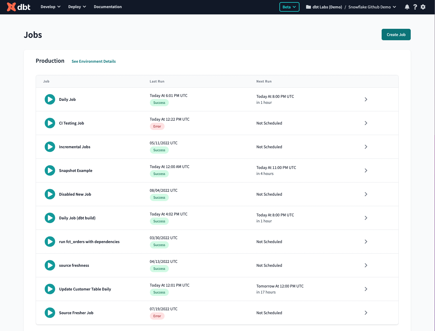
Say farewell to the hamburger menu! We’ve decided to end it in favor of making better use of the already existing top navigation bar. This simple change will make it easier for users to understand where they are in the application, and get them to wherever they’re going next in fewer steps. Same content, easier access! It’s also worth noting that Run History, Jobs, Environments, and Data Sources are all now under the Deploy tab.
No more disappearing menu items
Previously, the Documentation and Data Sources links would only appear in the menu when they were configured for a given project. In order to create a more consistent user experience, we’ve made these persistent. Helpful empty states provide guidance to users, making it easier to understand how/why/when to configure those things for your project.
Account & Profile Settings
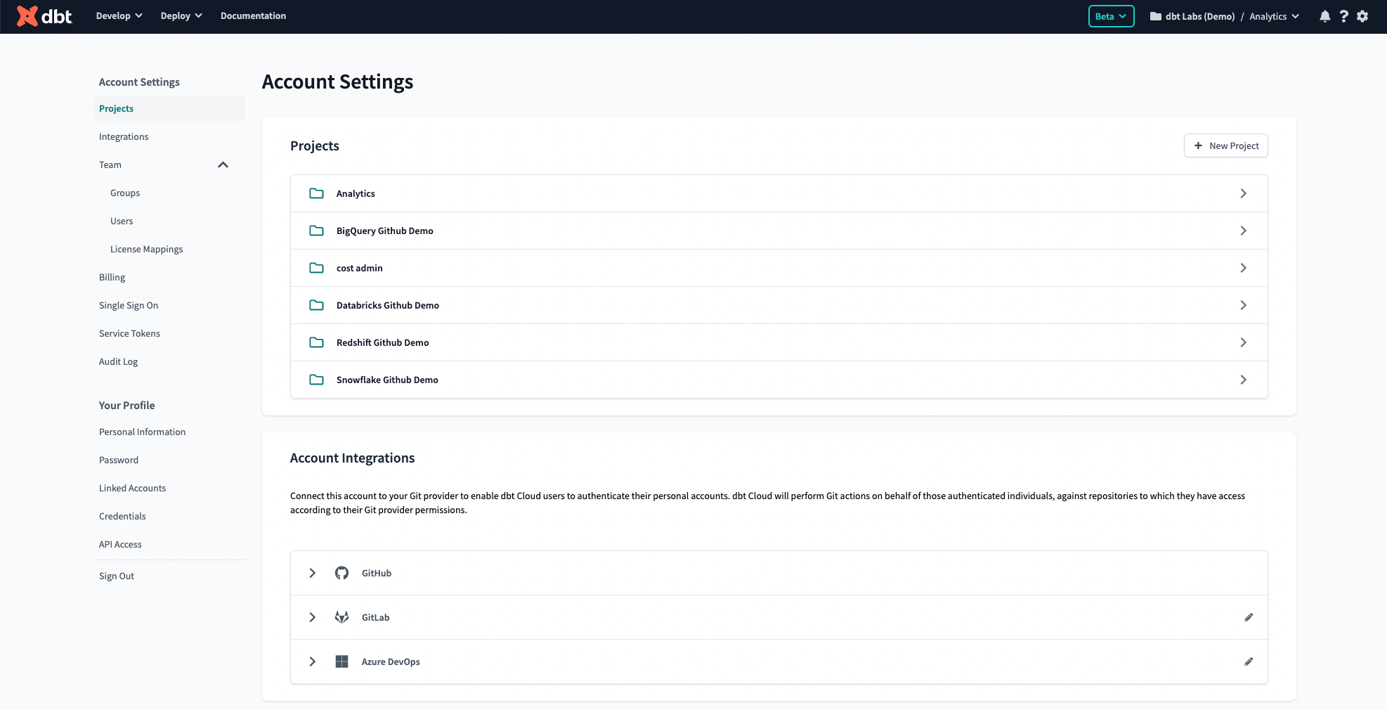
In the current UI, these are separate pages. Account Settings is accessible via the hamburger menu, and profile settings via your user avatar at top right. Currently, these two pages look nearly identical. We’ve now consolidated the settings in one place, making it easier to switch between the two should you need to do so.
On the subject of duplicated naming, we’ve renamed Profile Settings > Integrations to Linked Accounts.

What’s next
The ability to opt-in to the new UI will be available to everyone soon. This will appear in the form of a link at the top of your navigation bar in dbt Cloud. Opting in is a “two way door”: for at least the coming few weeks, you will have the ability to opt back out of the new UI at any time if you so choose, just in case something is not working for you in the meantime. Eventually and hopefully quickly, we will make the new UI the default experience for dbt Cloud, with the ability to opt-out to the classic UI for a period of time, and continue to respond to feedback before we deprecate the classic UI. Keep an eye out in our release notes for further updates!

I’m very excited for this next phase of dbt Cloud. It won’t happen overnight, and we will need your help. We strongly encourage participants in the new UI rollout to share feedback, so we can iterate and create the best experience possible for you. I can personally promise that not a single piece of feedback will go unread!
We are also rolling out a beta program for a reworked IDE experience that includes a host of performance and reliability improvements in addition to the UI changes I’ve talked about here. If you also wish to participate in the upcoming IDE beta, please fill out this form and we’ll get back to you shortly.
Thanks for reading! Please don’t hesitate to reach out to me on the dbt Community Slack (@Jeremy Hutt) for further comments or questions.
VS Code Extension
The free dbt VS Code extension is the best way to develop locally in dbt.


